

You Have More Data Than You Can Use
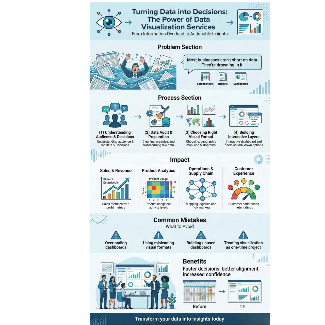
Most businesses today are not short on data. They are drowning in it. Dashboards filled with numbers, spreadsheets with thousands of rows, and reports that nobody reads past page two. The data exists, but the decisions it should inform are either delayed or never made.
The problem is not the collection. It is communication. Raw data in its original form is difficult for most people to interpret, especially when decisions need to happen fast. When data is presented poorly, teams default to instinct instead of evidence.
This blog explains how turning raw data into clear visual formats changes the way businesses make decisions.
Why Spreadsheets and Raw Reports Fall Short
A spreadsheet with ten columns and a thousand rows contains valuable information. But extracting meaning from it takes time and analytical skill. Most decision makers are not analysts. They are product leads, operations heads, founders, and sales managers who need patterns to surface quickly.
Raw reports also fail at context. Revenue of 4.2 million sounds strong until you realize it is 18 percent below target. A churn rate of 6 percent seems manageable until you see it has doubled in three months.
Visual formats such as charts, graphs, and interactive dashboards add context that raw numbers cannot. They make comparisons, trends, and outliers immediately visible.
What the Process Actually Looks Like
Good data visualisation is not about making charts look attractive. It is about making the right data visible to the right people in a format they can act on.
1. Understanding the Audience and Decisions
Before designing a single chart, the team must understand who will use the output and what decisions it supports. A CFO reviewing quarterly performance needs a different view from a marketing manager tracking campaign metrics.
2. Data Audit and Preparation
Most business data is messy. It lives in multiple systems, uses inconsistent formats, and contains gaps. A reliable data visualisation service begins by auditing and cleaning the data to ensure the visual output is accurate.
3. Choosing the Right Visual Format
Not every dataset belongs in a bar chart. Time series data works well in line charts. Distribution data suits histograms. Geographic data calls for maps. Choosing the wrong format can misrepresent the data entirely.
4. Building Interactive Layers
Static charts work for presentations. For ongoing decision making, interactive dashboards allow users to filter, drill down, and compare segments independently. This reduces dependency on analysts for every follow up question.
Where This Creates Real Business Impact
Data visualisation is not optional in data driven organizations. In several business functions, it directly affects the speed and quality of decisions.
Sales and Revenue Tracking
Sales teams that see pipeline health, conversion rates, and deal velocity in visual dashboards respond faster to problems. A sudden drop in lead quality appears immediately in a well built chart, while it might go unnoticed in a monthly spreadsheet.
Product Analytics
Product teams use visualised user data to understand feature adoption, drop off points, and engagement trends. A data visualisation service that understands product contexts can build views that connect user behavior to product decisions without requiring manual database queries.
Operations and Supply Chain
Inventory levels, delivery timelines, and vendor performance become manageable when displayed visually. Teams can spot bottlenecks and seasonal patterns at a glance instead of digging through transaction logs.
Customer Experience
Support ticket trends, satisfaction scores, and response times tell a story when visualised over time. Patterns that would take hours to find in raw data become obvious in a well designed dashboard.
Common Mistakes Businesses Make
Even with good tools, many businesses get data visualisation wrong.
-
Overloading dashboards with too many metrics, making none of them clear
-
Using visual formats that distort data, such as truncated axes or misleading scales
-
Building dashboards nobody uses because they were not designed around actual workflows
-
Treating visualisation as a one time project instead of an evolving system
A capable data visualisation service addresses these risks by involving stakeholders early, testing dashboard usability, and planning for iteration.
What to Look for in a Visualisation Partner
If you are considering working with an external team, focus on these factors:
-
Do they ask about your decision making process before proposing a solution?
-
Can they work with your existing data infrastructure?
-
Do they have experience with your type of data, whether financial, behavioral, operational, or geographic?
-
Do they design for usability, not just aesthetics?
-
Can they support updates as your data needs change?
The best partners treat data visualisation as a product, not a one time deliverable.
Conclusion
Data without clarity is noise. The ability to turn complex datasets into visual formats that inform real decisions gives businesses a measurable advantage. Whether you are tracking revenue, monitoring user behavior, or managing operations, well designed visual systems make teams faster, more aligned, and more confident in the decisions they make.
Frequently Asked Questions
Q1. What is the difference between data visualisation and data analytics?
Data analytics involves processing and interpreting data to identify patterns. Data visualisation presents those insights in visual formats such as charts, graphs, and dashboards so they are easier to understand and act on.
Q2. Which tools are commonly used for data visualisation?
Organizations typically use business intelligence platforms, custom-built dashboards, or web-based reporting systems depending on their data sources, technical infrastructure, and interactivity requirements.
Q3. How long does it take to build a custom dashboard?
A focused dashboard project typically takes three to six weeks, depending on data complexity, number of views, and interactivity required. Ongoing refinement usually follows the initial build.
Q4. Can data visualisation work with real time data?
Yes. Many modern dashboards connect to live data sources and update in real time or near real time. This is especially valuable for operations, sales monitoring, and system performance tracking.
Q5. How do I know if my current dashboards are effective?
If your team still relies on ad hoc reports, frequently requests custom data extracts, or avoids using the dashboard altogether, the current setup likely does not match their decision-making needs. A usability review can help identify specific gaps.